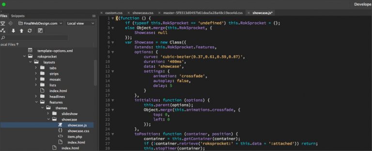
So you have an interest in learning more about CSS and how it can help you advance your web design and computer programing skills. While CSS is a foundational part of the modern web and has changed the way developers design and style websites.
CSS or Cascading Style Sheets defines the look and feel of an HTML document. While the HTML document describes the structure of the web pages the CSS controls the look.
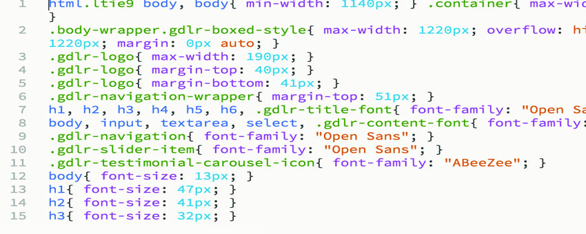
The number one reason web developers use CSS files is to separate the website style from the structure of the website. CSS allows for changes throughout a website to all be changed at the same time through the CSS document.

Knowing the structure of a CSS syntax is important in structuring any Cascading Style Sheet correctly. There are many different properties that you can get familiar with to help design your website with CSS.
Combined with HTML, CSS is a great tool to help build professional website designs. After you have learned HTML and CSS it is recommended that you learn Javascript which will open up new website features for building out interactive websites.
How a CSS Rule Is Structured
Every rule you write has two parts. The selector decides which elements are affected, and the declaration block lists what changes. Each declaration is a property and a value separated by a colon and closed with a semicolon, like color: #333333;. Once that pattern clicks, most of learning CSS becomes a matter of building vocabulary rather than learning new syntax.
The Selectors You Will Reach For Most
A type selector targets elements by name, so p affects every paragraph on the page. A class selector starts with a period and is designed to be reused across many elements, which makes it the workhorse of almost every stylesheet. An ID selector starts with a hash and should match only one element per page. You can combine these into descendant selectors, so .sidebar a reaches only the links inside a sidebar. Pseudo-classes such as a:hover and attribute selectors such as input[type="email"] cover the remaining cases.
The Cascade, Specificity and Inheritance
The word cascading in the name refers to how conflicts get resolved. When two rules target the same element, the browser first compares specificity: inline styles outrank ID selectors, IDs outrank classes, and classes outrank plain element selectors. If two rules carry identical specificity, whichever appears later in the stylesheet wins. Many properties also inherit, meaning a font family set on the body element flows down to everything inside it unless a child overrides it. Understanding these three behaviors explains the vast majority of moments where a style seems to be ignored.
The Box Model
Every element on a page is drawn as a rectangular box made of four layers: the content itself, then padding, then a border, then margin. By default the width property describes only the content layer, so padding and borders get added on top and the element ends up wider than expected. Setting box-sizing: border-box; tells the browser to include padding and border inside the declared width, which is why most modern stylesheets apply it globally as one of the first rules.
Where Your CSS Should Live
CSS can be written inline on an element, placed in a style block in the document head, or kept in a separate file linked from the head. External stylesheets are almost always the right choice. The browser caches them across page loads, one edit updates every page at once, and your markup stays readable. Inline styles are worth avoiding except when a value genuinely has to be calculated for a single element.
Making Layouts Respond to Screen Size
Media queries let you apply different rules at different viewport widths. A block such as @media (max-width: 768px) { ... } only takes effect on narrower screens, which is how a three column desktop layout collapses into a single readable column on a phone. Flexbox handles arranging items along a single row or column, while CSS Grid handles two dimensional layouts where rows and columns both matter. Between those two, most layout work no longer needs floats or positioning hacks.
Custom Properties
Modern CSS supports variables natively. Declaring something like --brand-blue: #0b5fff; on the root element lets you reference it anywhere with var(--brand-blue). Changing a brand color across an entire site then becomes a single edit, and because custom properties are live in the browser they can also be swapped at runtime for features such as dark mode.
Mistakes Worth Avoiding Early
Three habits cause most of the frustration beginners run into. Reaching for !important to force a style usually hides a specificity problem that will get worse over time. Repeating the same color or spacing value in dozens of places makes later changes painful. Writing deeply nested selectors ties your CSS tightly to your HTML structure, so a small markup change breaks the styling. Keeping selectors shallow, naming classes for what they mean rather than how they look, and reusing values through custom properties will keep a stylesheet maintainable long after the first version ships.